We have a new look

For 15 years we have been accompanying companies in digital change. With a stronger focus on digital product development and human-centred design, we create sustainable digital products and services.
The internally developed brand design underlines these core competencies – the combination of sophisticated technological solutions with human-centred design.
Human-Centred Design and Technology united.
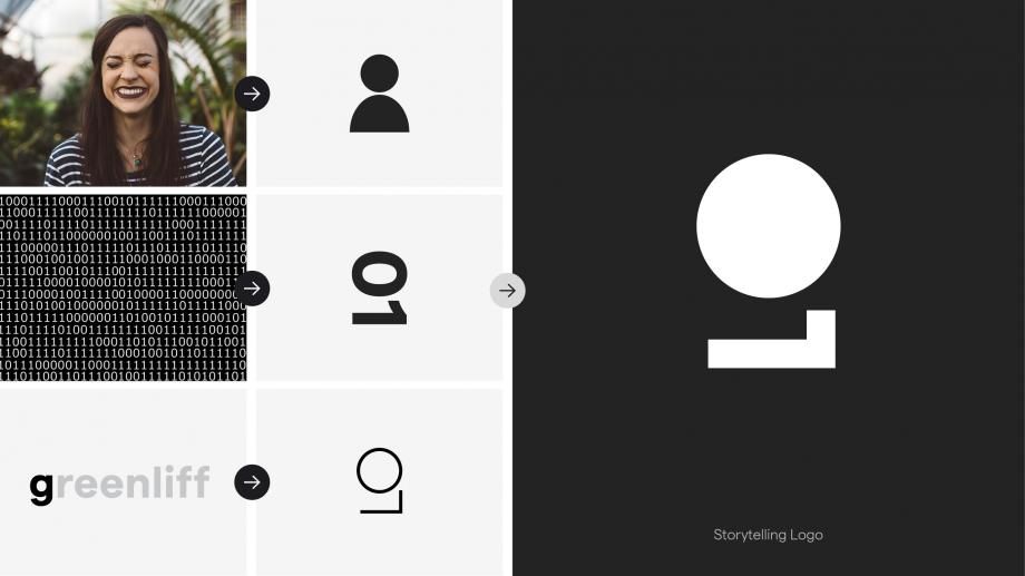
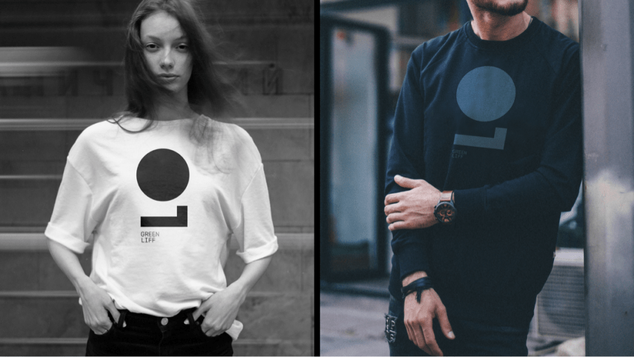
The distinctive icon forms the heart of the rebranding and makes our brand perceptible. It generates strong employee identification and a high degree of recognition on all digital channels. The symbol shows an abstracted "g", which unites both the binary code O1 and the abstract form of the human upper body.
Clarity and Character
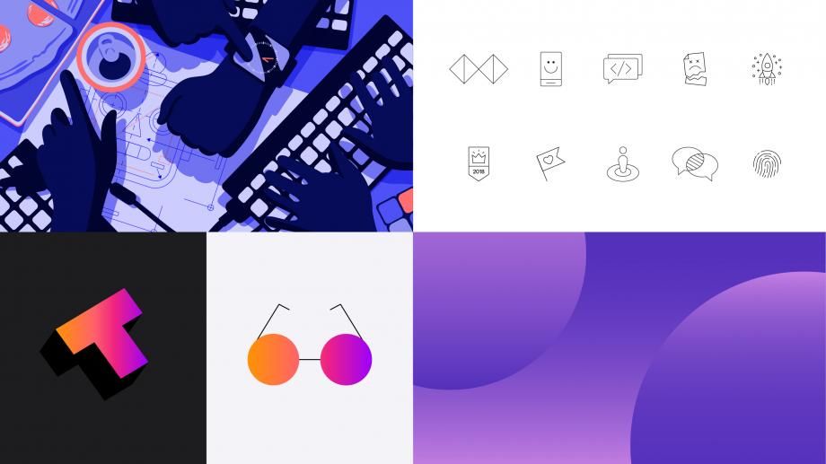
The striking symbol is complemented by a dynamic colour concept and illustrations and pictograms with strong characters, which trigger sympathy in the viewer. The modern, sans serif typeface, brings information clearly and concisely to the point. Illustrative backgrounds and colours react to changing communication needs and create focal points and clear orientation both online and in print.
«It was important for us to keep the new positioning and image as well as content and development in-house in order to let all employees participate in the design process and to strengthen identification with the realignment.
says Markus Pilz, CEO of Greenliff
«The agile development process allowed us to move the project from strategy to new branding and website in just 3 months.»
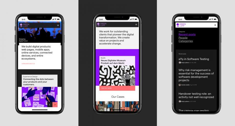
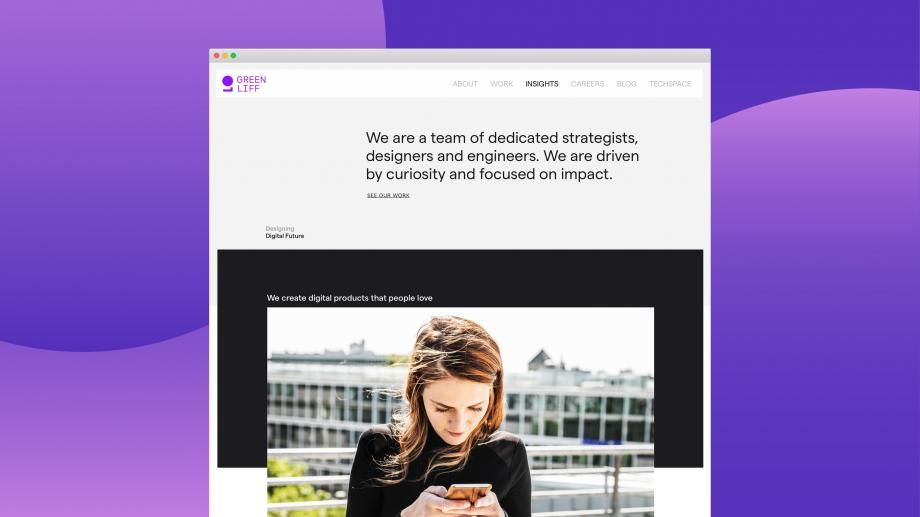
New Website
The new website was the first big step in the implementation of the new brand identity - and even though we want to continuously develop and enhance it - we already love it. The time required to maintain the content has been greatly simplified and automated. The new website gives users quick and easy insights into our agency and inspires by knowledge articles and news on the topics of "digital transformation" and "digital product design". The website was implemented in Drupal 8.
Do you like our new website? We are looking forward to your feedback and input.
On our brand page you can get more information about our new brand identity.